
contemporary art contest
concorso internazionale
d'arte contemporanea


The two things for which Longarone is most famous have approximately the same age.
At the entrance to this small town a sign informs visitors that they are entering the City of Ice Cream.
This area in the province of Belluno is celebrated for this product, and for over 50 years the city has been home to the International Exhibition of home-made ice cream.
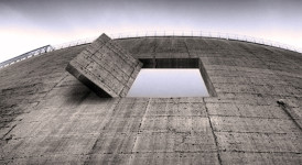
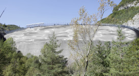
(picture 01). The work I propose to paint on the wall of the dam (02, 03) is a re-elaboration of the logo of GELATI SANSON, a well-known industrial brand typical of this region of Italy, that has been removed from the market.
The graphically bold and modern red letter S of the logo is extended to show the water level within the reservoir on 9 October 1963 before the massive landslide that caused the overflow. The logo is in the form of a kind of cloud with a double outline, one green and one blue, with reflections, the colours of which evoke those of the natural mountain environment. This complex logo was the product of a very effective analysis of the image and its subtle meanings.
SANSON was an Italian food company (04) that influenced the modern culture of the country, also due to the classic entrepreneurial success story of its founder, who was known as the king of the ice cream. For at least 40 years its image was an important element of the popular imagination, appearing on TV and associated with the worlds of entertainment and sport (it was the first sponsor of cycling, especially the world champion Francesco Moser (05), as well as of the Udinese Calcio football team). It thus became a part of mass culture, a phenomenon that is generally snubbed and ignored by those in power, but that has been well understood and manipulated by the main protagonist of Italian politics over the last twenty years.
The project aims to emphasize, by means of the elaboration of an advertising logo from the recent past, the complex world of memories and images that Italy has invented in the modern age. The logo and the brand of SANSON, associated with a pop culture that is seen as having a marginal importance, represents not only a product, but also the world of work, enterprise and successful ideas, as well as a historical period that has disappeared, and the long story of the desires and creativity of the Bel Paese – often masterfully interpreted by advertising – a country that is constantly torn between hopes and dreams, limitations and illusions, great achievements and tragic failures.
Size: line mt. 180×0,5; the logo is m. 15×10.
–
Hanno la stessa età le due cose per cui è famosa Longarone.
All’entrata del paese un cartello avverte che siamo nella Città del gelato.
E’ l’eccellenza del territorio, concentrato nel Bellunese e la città ospita da più di 50 anni la Mostra Internazionale del Gelato Artigianale (immagine 01).
L’opera proposta è un’elaborazione, dipinta sulla parete della diga (02, 03), del marchio GELATI SANSON, nota marca industriale veneta ora scomparsa.
L’estensione della lettera S, rossa, graficamente audace e moderna, diventa naturalmente la linea dell’acqua che marcava la quota all’interno del bacino artificiale del 9 ottobre 1963. La scritta è interna ad una specie di nuvola con due strisce, una verde e una blu con riflessi azzurri che evocano i colori dell’ambiente della natura e montano. Brand complesso, precisa sintesi di un processo di analisi di immagini e significati.
SANSON era un’azienda alimentare (04), una classica storia imprenditoriale italiana di successo, tanto che il suo fondatore era chiamato il re del gelato e che influenzò la cultura moderna del Paese. Per almeno 40 anni ha significato un immaginario popolare che, fra TV, spettacolo e sport -fu il primo sponsor del ciclismo con il campione del mondo Francesco Moser (05) e del calcio con l’Udinese, divenne parte della cultura di massa, un fenomeno generalmente snobbato e sfuggito ai tradizionali detentori del potere e invece ben compreso dal principale attore politico degli ultimi vent’anni.
Il progetto mira a fare emergere, con un’elaborazione di un logo pubblicitario del recente passato, un complesso mondo di ricordi e immagini che l’Italia, nell’età moderna, ha saputo inventare. Il marchio SANSON apparentemente laterale e pop, rappresenta, oltre al prodotto, il mondo del lavoro, dell’impresa e un’idea vincente, ma anche un tempo scomparso, una lunga storia di desideri e della creatività del Bel Paese -tradotta magistralmente dalla pubblicità- in bilico fra speranze e sogni, limiti e illusioni, conquiste e tragici fallimenti.
Misure dell’opera: linea m 180×0,5; logo inscrivibile in m 15×10


 firenze
Visions, projects, projections from Vajont
Nuovo Spazio di Casso
[...]
Tuesday, June 15th 2021, 2 – 4 PM, webinar panel:
two calls for vajont: fase _restart.
Vajont: [...]